How to Write Art, Artist & Gallery Press Releases,
Announcements, Newsletters, Updates
Press releases, announcements, newsletters, invitations, social media posts, and other types of updates are key to artists, galleries and arts organizations getting the word out about what they're up to including, upcoming shows, exhibitions, events, activities, new art, and much more. Regularly publishing and sending these notices is important, but do you know what's even more important? Making sure people read, understand, and finish them. And do you know what's even more important than that? Making sure people take action once they read them, like buying art, attending events, sharing the news, etc.
No matter what platform or format you use or how you get the word out, have something newsworthy to say. Make sure it's something your fans and followers will care about. If you send too many updates about nothing special, people will start deleting them before they even open or read them or worse yet, unsubscribe or unfollow you. No artist, gallery, or arts organization wants that.
Make sure anyone can understand what you're writing about, regardless of how little or how much they know about your art. Give everyone an opportunity to appreciate what you have to say. Resist the urge to write for specialized audiences because they're difficult for everyone else to understand. Remember that anyone can become a fan, follower, buyer or collector regardless of their knowledge level, so never shut anyone out.
Before even starting, make sure all email announcements you send are formatted for mobile devices as well as computer screens. You'd be surprised how many aren't. More people than ever check emails on their phones, and that number is only increasing. If your announcement is formatted for computer screens only, the print will be too small to read on phones. And that often means delete.
The opening paragraph or two of your update should be written for as broad an audience as possible. Don't worry about the regulars; they'll skip the parts they already know and go straight to the info they need. Keep in mind that in the online age where things get shared, cross-posted, forwarded, and commented on, pretty much anyone anywhere can end up reading what you write. So make sure you provide enough easy-to-understand basic information for anyone likes what they're looking at to want to know more.
Less is better than more. A good press release, announcement or update should be more like a concise introduction, teaser, or come-on than a lengthy essay. The best ones entice people to want to know more, and to take some kind of action. No matter how much you love to write, resist the urge to overwhelm your audience with words. Leave readers wanting more rather than less. There's no need to inundate them with every last detail of what you're up to in every announcement you send.
If you must get detailed, technical or specialized, do it after you get the basics across. You don't have to write entirely for beginners, but always include a paragraph or two for them on what the update is about and why they should care. This gives them a chance to contact you directly, click over to whatever links you provide, subscribe to your list or page, start following you, visit your studio or gallery, share what you've written, or make contact in some other way.
Make sure readers see the most important information first, preferably at the top of the announcement. Get it out there fast and keep it separate from the rest. These facts are all most readers care about or have time for, so never bury them somewhere in the text or make them hunt for it. Once you get the essentials out, then you can talk about whatever else you've been up to lately, or get into other secondary topics. Headline news always comes first.
All announcements, updates and press releases should start with answers to the who, what, when, where, and why of whatever you're writing about. Your title line, subject line or headline should state who it's about (you, others, your gallery, etc), what it is (the name or title of the event), when it's happening (the date), and where it's happening (the location - either physical or online). For example, "Bill Smith Solo Show of New Work Opens at Triple-A Fine Arts on November 2." Immediately below the headline in a paragraph or two come the reasons why it's happening or the significance of the event, basically elaborating on the headline. Here you provide a brief summary or description of the event along with other relevant details. You can continue on with more background information or explanations if you want, but clearly keep it separate from the essentials.
At the bottom the announcement, you can include a brief standard statement or bio about you or your gallery or organization, similar to the "About" page on a website or social media profile. Readers who might not be familiar with you appreciate a summary introduction about who you are and what you do. You might mention details like how long you've been active or in business, where you're located, what you specialize in, what you're known for, significant career highlights or distinctions, and so on. Limit this to a single paragraph.
For quick reference, end with your full contact information for anyone who may want to subscribe, follow you, join your list, learn more, visit, or otherwise make contact. This includes your hours if you're a business.
Adding an image or two (which hopefully download FAST) is also recommended. Good compelling images slow readers down at least for a moment and encourage them to read more when they like what they see. Don't overuse images though; long strings of images can get boring, confusing, overwhelming, or be slow to load. If you are writing about a group of artworks, link to the rest for anyone who wants to see more-- like on your website or social media pages. Let the readers decide how little or how much they want to see.
If you are sending to the press or media, keep in mind that they don't have time for complicated, overly detailed, or wordy notifications. Datebook, calendar or events website editors, art writers, newsletter or blog or magazine editors, curators, critics, gallery owners, and others with significant art world standings typically receive tons of announcements, have limited patience, and HATE wasting time. If they can't figure out what's going on fast, they often give up and hit delete.
Limit the size of your announcement to three or four paragraphs at most, preferably three or under. The mere visual appearance of too much text can be a turn-off in itself, and may reduce the chances that recipients will read it. Some people get intimidated by how much time they think they'll have to spend reading, and hit the delete key instead. Remember-- you're in competition with all those other artists, galleries and organizations sending out similar announcements, so compete wisely.
The most effective updates keep to a single story, event or news item. If you must write about more than one event or story, have an index or table of contents up top so readers can easily find what they want and go straight to it without having to sift through everything. Clearly divide the announcement into topics or categories like panels, talks, openings, fundraisers, walkthroughs, etc. The worst announcements list item after item, event after event, update after update, in no particular order. If some of these emails were actual sheets of paper, they'd run on for pages. Those of you publishing multi-topic announcements might click the print button to see how many pages they are before sending them. You might be surprised.
Put another way, don't make people scroll; people hate having to scroll through content they could care less about in order to find the one or two stories they really want to read. Run-on newsletters or updates are a great way to lose subscribers. Do your best to make sure readers can get wherever they want to go fast.
We all know how short online attention spans are these days, how quickly we want our news, and how little time and effort we want to spend getting it. Keep this in mind whenever you compose a newsletter, announcement or update. Tell the full story fast. That's how to maximize the chances that people will take action, make contact, or participate in other ways. Even if they don't, they'll least appreciate you for being quick, clear and concise, and will hopefully look forward to your next communication.
***
Need professional art writing? I write for artists all the time-- statements, essays, press releases and more. If you need good quality writing, you're welcome to email me -- Alan Bamberger-- or call 415.931.7875. Let's talk about what you need and I'll tell you what I can do.

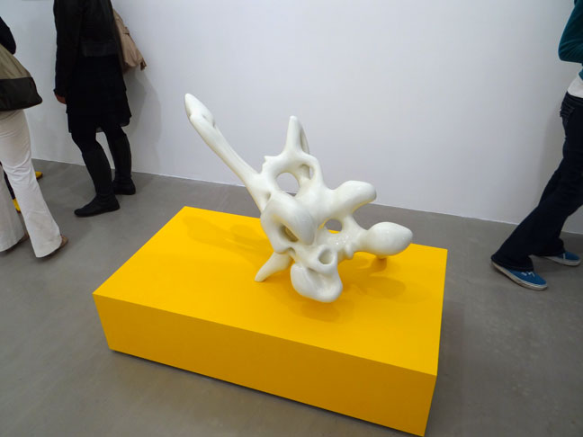
(art by Nick Ervinck)

Current Features
- How to Buy Art on Instagram and Facebook
More and more people are buying more and more art online all the time, not only from artist websites or online stores, but perhaps even more so, on social media ... - Collect Art Like a Pro
In order to collect art intelligently, you have to master two basic skills. The first is being able to... - San Francisco Art Galleries >>


