Self-Publishing for Artists:
How to Publish Books, Catalogs,
Brochures of Your Art
Q: I'm beginning to get more recognition as an artist and want to print a small book, catalog or brochure to help market, present, promote and get the word out about my art. I thought maybe I'd include a short bio, a list of galleries where I've exhibited, and some color reproductions of my work. What do you think?
A: Self-publishing can be great promotional tool for artists. Creating a hard-copy publication is easier than ever, and thanks to numerous self-publishing websites, you can do a really professional job. First off, I'd recommend a book or catalog over a brochure; you want to make sure it's substantial enough for people to want to keep, rather than skim through and throw out. You want your hard work to end up on bookshelves and in file cabinets rather than in the trash. If you're just starting to get noticed and are on the way up, publishing in the 12 to 50-page range is reasonable. As you get better known, you can lengthen accordingly.
A good printed piece improves your ability to promote and market your art. For one thing, it's something people can hold in their hands-- "tangible proof" of your success. It promotes your art for you rather than you having to open your mouth... always a plus. All you have to do is hand them a book or catalog and let it do the talking. Not only is it a great way to advance conversations with people who appear to be serious about your art, but it's even better to give away free when someone buys an artwork.
In terms of layout, organization and design, spend time looking at other artist books and catalogs before going ahead with yours. Visit a good art library or gallery library and browse books and catalogs of better known and even famous artists who you follow and respect. Pay particular attention to publications from museum and institutional shows; these are almost always designed and written by recognized curators, scholars, historians and professionals, and are often the best examples to emulate in terms of what your finished product should look like.
If possible, speaking with a museum, institutional or major public library art librarian is also recommended. That way, you'll better understand scholarly and archival value of art and artist books and catalogs, and of what works best in terms of organization, information to include, and layout. If possible, have them show you examples of art and artist publications they respect the most and explain to you what makes them superior.
Depending on the depth and extent of your accomplishments and career, a good basic catalog or short book generally includes some or all the following, and usually in this approximate order:
* A brief introduction to the catalog.
* An opening essay either about you and your art career to this point, your art in general if the catalog is a survey of either all of your art or a specific series or body of work. Essays often range in length from two to twelve pages or so, assuming the catalog is 50 pages or less.
* Illustrations of the art accompanied by essential information like title, size, medium, date, brief explanation if necessary, etc. Make sure they're organized in some way (by date, subject matter, location, etc). Random order confuses readers.
* A chronology of significant art-related events in your life.
* Your exhibition history (resume or CV).
* Awards, commissions, and other recognitions you've received in your career.
* A list of your reviews, features or mentions in books, catalogs, periodicals, or online.
* A list of collections and collectors who own your art.
Regarding an essay on your art, the most important thing is to be concise, organized, and stick to facts. The purpose of a good first catalog is to introduce your art and get essential information across to the readers. People want to know who you are, what your art is about, and how it's evolved. Keep it simple; avoid complicated or lengthy interpretations or explanations of your work. Save those for later. You'll only confuse readers if you do this, or worse yet, lose their attention completely because they'll have trouble understanding what they're reading. That kind of writing is best left to the critics anyway.
Regarding a biographical essay, it should summarize the evolution of your career from its beginnings to now, including how you got started, significant milestones, and art world accomplishments. That's usually enough to get readers interested. Confine it to high points of your progress as an artist; save your entire life story for later.
If possible, have a recognized art critic, professor, curator, gallery owner, or related professional do the writing, or at least some of it. Even a brief forward or introduction, quote, or comments about your art are good. The more prominent the names you can associate with your art and your publication, the better. Keep in mind that some of these people may require a fee to do whatever you're asking. If it's reasonable and you can afford it, go ahead and say yes.
Regarding your illustrations, make sure you're presenting a unified, organized, cohesive, and understandable selection of your work. Everything should fit together and relate. Make it easy on your readers and avoid random, difficult to explain, difficult to understand, or disorganized selections.
Most introductory catalogs include a good representative selection of the artist's CURRENT works of art, usually no older than a year. In the art world, the watchword is "What have you done for me lately?" Show 30 works, for example, created over a ten-year period and people will wonder what you've up to besides making art, and whether being an artist is really a priority for you.
You can add a handful of select past works if you want (positioned after the current works) in order to provide context for the current work, but choose significant ones that easily relate, preferably ones that are notable in some way-- like receiving awards, being juried into prestigious shows, being in significant collections, and so on. Past works should speak to your credibility as an artist. In fact, every aspect of your book or catalog should reference your accomplishments and commitment.
Don't crowd your illustrations; one per page on most pages is the best way to go. If groups of works are related, perhaps show two to four on a page, but no more than that, and not on any more than a few pages. Too many densely presented visuals can get confusing, plus smaller illustrations reduce the visual impact of the art. Your goal is to provide a comprehensive and visually compelling record of where you are in your art career NOW. When possible, get opinions from informed individuals who you know and trust about which pieces to include. That's preferable to making all the selections yourself.
Regarding your exhibition history, resume or CV, start with your most recent shows and backwards by date to the earliest. If you've had many shows, list solo shows first, followed by group shows (from most recent to oldest). You don't necessarily have to include everything; if you've got a deep resume, stick to your most significant exhibitions and career-related events. A good solid resume without too many gaps shows potential buyers and collectors that you are actively producing, exhibiting, and are serious about your career. Gallery owners, writers, and researchers like resumes because they provide easy access to important dates, honors, awards, grants, people and places. If you want to include your educational credentials, list them at the end; they're nice to know, but not critical to where you are now or where you're going (and they'll become less and less so over time).
Before you publish, be sure to show your mock-up to experienced informed art people who you know and trust. While you're at it, show it to some normal everyday people too who just plain like your art. Get everyone's opinions and seriously consider everything they say. If you hear similar criticisms more than once, think about reworking the necessary passages. You want the finished publication to be as easy to understand, appreciate, and have as broad an appeal as possible. Having a professional editor or proof reader go over your copy before you publish is also an excellent idea.
Additional Considerations:
* With each illustration, include the title, dimensions, medium, completion date, and other relevant information, like where it might have been exhibited, any awards it might have won, if it's in a private or institutional collection, etc. If it's sold, list the owner. If an owner prefers not to be mentioned, say the piece is in a "private collection."
* If you're fairly productive, think about including a checklist of past works, or of significant or major works. The more comprehensive it is, the better. Again, doing this speaks to your productiveness, dedication, and commitment to being an artist. It will also come in very handy for anyone who needs to research or document specific works of your art at any point in the future.
* Want to make it official? Get an ISBN number. If you're publishing in both hard and soft cover, get an ISBN for each.
* Want to make it really official? Send two copies to The Library of Congress. You might also consider giving copies to museum, public or institutional libraries areas where the most people are familiar with your work... but contact their acquisitions departments first and ask if you can send copies.
What to avoid:
* Name dropping. Mentioning the world's great artists or art movements with the intention of forming connections between your work and theirs is not productive. Readers won't take this seriously, and you certainly don't want to put your art up against art by the great artists of all time. That's a losing battle no matter how you look at it.
* Excess padding. Don't include the names of every single person who owns your work, every single place where you've shown, shows or exposure that you got only because you paid for it, or make it seem like you've accomplished a lot more than you really have. Knowledgeable readers can spot these tactics in an instant and will not take you or your publication seriously.
* Exaggeration. Tell it like it is and not like you want it to be. For example, if you once hung a painting for a week at a bar in Berlin, don't use it as an excuse to say you've exhibited internationally. Misrepresenting yourself or your accomplishments can negate everything else you're trying to accomplish with your catalog, whether it's true or not.
***
A well-written and illustrated book or catalog becomes a historical record of your artwork that ultimately outlasts you and serves to document a particular period of your career for anyone researching your art in the future. So take your time, think it through, and get professional input or opinions whenever possible. Create a lasting legacy for yourself and your art starting now.

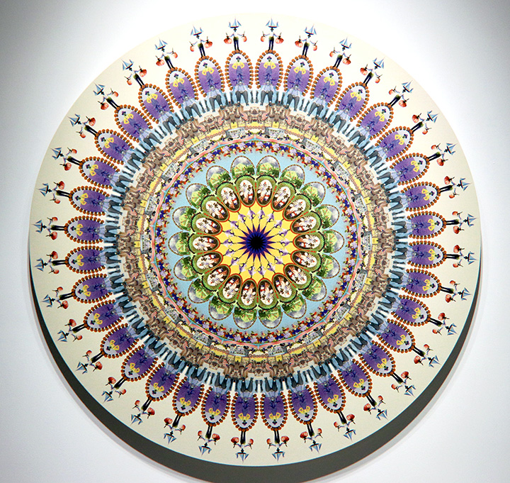
(art by Dana Hart-Stone)

Current Features
- How Any Artist Can Price Their Art for Sale
Pricing your art is different from making art; it's something you do with your art after it's made, when it's ready to leave your studio and get sold either by you personally or through a gallery... - How to Organize and Document Your Art
Anytime is a great time to sort, organize and document your art. Why bother doing this? Because creating... - San Francisco Art Galleries >>


